



Our Brand MAP

What’s in a brand? There is so much more to a brand than a logo, and it’s our pleasure to infuse art, science and spirit into every aspect of your experience with our company.

Why we exist

We help you design the life & company you want, with hemp.

The planet is being destroyed and it’s up to business owners and product creators like YOU to do something unique & different. We believe all are born deserving to win in life, mentally, spiritually, emotionally, financially and in our relationships. And we know hemp can be a vehicle or tool for experiencing this transformation on Earth.

The HempAware design system

Brand guidelines

The exact colors, type, components and rules behind every page on hempaware.com. Use them to keep everything we make feeling like one brand.

02

Color

A calm green foundation with one warm action color. Coral means “click here,” so it is used sparingly.

#2E5E0E
Deep Greenvar(--hg)

Primary brand color. Dark sections, icons, links, headings accents.

#FF784F
Coralvar(--hcoral)

Primary actions only: the main button in each section.

#DB9D47
Goldvar(--hgold)

Accents: eyebrow numbers, underline rules, highlights.

#226CE0
Blue

The Aware in our wordmark and focus states.

#14110F
Near-Blackvar(--hink)

Headlines and body text. Never pure black.

#F1D9A8
Soft Gold

Highlighted words and eyebrows on dark backgrounds.

#F3F6EF
Tintvar(--htint)

Alternating section backgrounds, chips and soft cards.

#FFFFFF
White

Cards, photo frames and light sections.

Dark hero overlay

Hero photos always sit under a deep green gradient, darkest on the left where the headline is: linear-gradient(100deg, rgba(12,26,9,.94), rgba(20,40,14,.84) 55%, rgba(20,40,14,.55))

03

Typography

Three typefaces, each with one job. Headlines stay tight and bold, italics add warmth, and the slab serif keeps long reads comfortable.

MontserratExtraBold 800 · Headlines, buttons, labels

Make your hemp dreams come true.

Libre BaskervilleItalic 400 · Eyebrows, subtitles, quotes

Hempower yourself and the world around you.

Roboto SlabRegular 400 · Body copy

We help hemp entrepreneurs and hemp companies design websites and marketing that increase conversions, sales and happy customers. Body text sits at 17 to 18px with a line height of 1.7 for easy reading.

StyleFontSizeUse
H1Montserrat 80040 to 64pxOne per page, in the hero
H2Montserrat 80030 to 44pxSection titles
H3Montserrat 700 to 80017 to 22pxCard and step titles
EyebrowLibre Baskerville italic17 to 18px, greenShort label above an H2
BodyRoboto Slab16 to 18px / 1.7Paragraphs
SmallMontserrat 500 to 60013 to 14pxNotes, tags, captions

04

Voice & writing

Bold, real and purposeful. We sound like a knowledgeable friend in the hemp industry, not a corporation.

Bold

Confident claims backed by 20+ years in hemp. We say what we do.

Real

Honest, specific and human. No hype, no jargon, no fake urgency.

Purposeful

Every word moves someone closer to growing with hemp, and the planet with them.

Do

  • Write in normal sentence case: “Get your free SEO audit”
  • Use commas, colons or periods to connect ideas
  • Name the action on buttons: “Book a call,” “Get the book”
  • Say “hemp, CBD & cannabis” when speaking to the whole industry
  • Use hemp wordplay like hempower or hempducated once in a while
  • Keep numbers specific and current: “20+ years”

Don’t

  • Use em dashes in any copy
  • Put headings in ALL CAPS
  • Use vague buttons like “Submit,” “Click here” or “Learn more”
  • Stack three parallel phrases for rhythm
  • Make health or medical claims about products
  • Leave placeholder or lorem ipsum text live

05

Components

These are live, working pieces of the site. Buttons are always pills with a round arrow, and coral is reserved for the main action.

Eyebrow & heading

What we do

Marketing for hemp companies

Chips & tags

  • Hempcrete
  • Hemp seed oil
  • Textiles
  • Active filter

Checklist

  • Learn from hemp experts
  • Save on marketing tools
  • Grow your ROI

Card (double frame)

Building & construction

A white card inside a soft outer frame with a gentle shadow.

Numbered step

01

Inquire

Set up a call to discuss your hemp marketing needs.

Quote

Tyler & HempAware have helped me generate several million in sales.
Lawrence Serbin, Hemp Traders

FAQ item

Do you work with cannabis brands?

Yes. We work with hemp, CBD and cannabis companies, from farms to product brands.

How long does a branding project take?

A brand identity typically takes about 2 to 3 weeks.

06

Layout

A handful of patterns, repeated with care. Consistency is what makes 40+ pages feel like one site.

Hero

Dark green gradient over a photo, eyebrow, one H1, short subtitle and a coral button.

Split

Framed photo beside copy. Alternate sides as you go down the page.

Card grid

3 or 4 across on desktop, 2 on tablet, 1 on phones.

CTA band

Deep green band with one clear action. Used once or twice per page.

  • Content width 1200px max, centered
  • Section rhythm Alternate white, tint and deep green sections
  • Spacing About 96px between sections on desktop, 64px on phones
  • Corners 999px pills, 22 to 32px cards and photos
  • Sub-nav Services, Learn and Connect pages carry their section menu under the hero
  • One CTA per section Never two coral buttons side by side

07

Imagery & icons

Natural, grounded and real. Photos feel like hemp in the wild and at work, never generic stock.

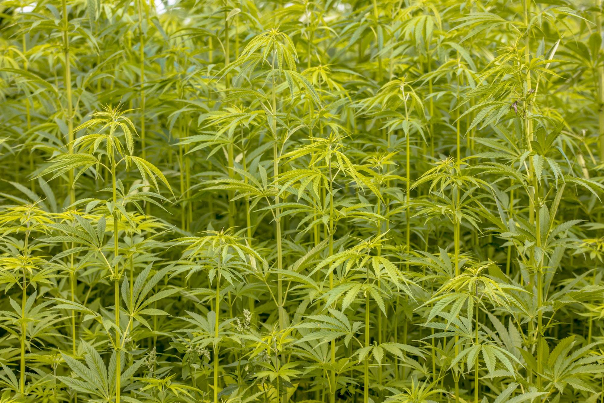
Hemp field in a HempAware photo frame
Framed photos White 8px frame, 22 to 30px corners, soft shadow. 4:3 for landscape, 4:5 for portrait.

Line icons

1.5 to 1.8px rounded strokes in deep green, on a 14px-radius tint tile. The hemp leaf is our signature mark, used for checks and badges.

Do

  • Use real hemp: fields, fiber, products, people at work
  • Show client work as real screenshots and mockups
  • Write descriptive alt text for every image

Don’t

  • Put important text inside images, since it blurs and can’t be read by Google
  • Stretch small images, which makes them blurry
  • Mix icon styles, filled and outlined, in the same section

08

Motion

Subtle and physical. Things lift a little when you touch them, then settle.

Hover me
  • Easing cubic-bezier(.32,.72,0,1), a quick start that settles gently
  • Duration 0.5 to 0.8s for lifts and fades, up to 1.2s for image zooms
  • Hover Cards lift 3 to 4px, images zoom to 104%, arrows nudge up and right
  • Respect Motion turns off for visitors who set reduced motion on their device

09

Accessibility & SEO

Good design works for everyone, and it is also what search engines reward.

One H1

Every page has exactly one H1 in the hero. Popups never use heading tags.

Heading order

H2 for sections, H3 for cards and steps. Never skip levels.

Alt text

Describe what the image shows and who it was for, in plain words.

Contrast & focus

Text meets contrast standards. Keyboard users always see where they are.

10

Our Brand Guide MAP

The original brand guide with our full story, mission, brand senses and assets, as a 6 page PDF.